Senka
Recruiters  Still Kickin'
Posts: 1,176
|
Post by Senka on Sept 8, 2007 10:18:03 GMT -8
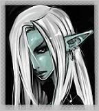
I crafted this up and was after opinions before i post it on my Werewolf forum page as a link pic  |
|
Senka
Recruiters
Still Kickin'
Posts: 1,176
|
Post by Senka on Sept 11, 2007 15:13:10 GMT -8
No comments ?
|
|
|
|
Post by Olorae on Sept 11, 2007 15:32:12 GMT -8
I gave you mine on IMs.
But I like it.
|
|
Senka
Recruiters
Still Kickin'
Posts: 1,176
|
Post by Senka on Sept 11, 2007 16:20:03 GMT -8
I know, I was trying to provoke more from the other members... I've added it to my website, feel free to use it for other links... with Kama's permission of course  |
|
alma
New Member
 Tiramisu Queen
Posts: 36
|
Post by alma on Sept 11, 2007 22:11:17 GMT -8
Its really cute, though the words are a tad hard to read. Maybe you can use different color as to make it stand out more? Just my opinion though  |
|
|
|
Post by Kyrael on Sept 12, 2007 14:13:40 GMT -8
It is very cute... I daresay it might almost be *too* cute for the concept behind the clan, but I suppose, on the right forums and such, it could work.
I think maybe less blue, more white... or something... in the text to make it stand out. As it is, it seems to fade into the background abit.
|
|
Senka
Recruiters
Still Kickin'
Posts: 1,176
|
Post by Senka on Sept 12, 2007 15:55:50 GMT -8
with all the cute RL ladies in the clan.. maybe it's not cute enough I'll have a play with the colours on the weekend and lighten the text.. maybe make the glow a light blue instead of red ? |
|
alma
New Member
Tiramisu Queen
Posts: 36
|
Post by alma on Sept 12, 2007 22:50:29 GMT -8
Mm that'll work for me i guess, its not so much of the glow, just that the text has almost the same colour as the background. Other than that, good job though  |
|
Senka
Recruiters
Still Kickin'
Posts: 1,176
|
Post by Senka on Sept 15, 2007 8:19:09 GMT -8
Here's the updated version, i played with the colours a bit, and 'greyed' up the flesh tones a little as well  Version 2  Version 3  Version 4 |
|
alma
New Member
Tiramisu Queen
Posts: 36
|
Post by alma on Sept 16, 2007 5:23:09 GMT -8
My pick would be version 3 |
|
|
|
Post by Olorae on Sept 16, 2007 6:54:49 GMT -8
I think I like the first one better. The other two just have too much purple.
|
|
|
|
Post by Tazhael on Sept 16, 2007 9:09:00 GMT -8
I like number 4. It is almost same colour as the background, but the glow makes it enough easy to read. And there is just correct amount of purple in number 3 and 4. Call me a gay if you want (though I am not <.<) But purple suits nicely in overall and it is also the primary colour in the picture ^^
-just my two adenas
|
|
|
|
Post by Olorae on Sept 16, 2007 14:36:49 GMT -8
Let me rephrase my answer, now that I see the labels on them.
I like number 2 the best. The one with the red text.
|
|